Hebrew cursive, often simply called Hebrew cursive handwriting, is a practical and expressive way to write the Aleph-Bet in daily life. Whether you’re signing a letter, taking quick notes, or learning the language for reading and conversation, mastering a smooth, legible cursive can enhance speed, fluency, and personal connection with the text. This article, Hebrew Aleph Bet Cursive: Learn to Write the Letters with Practical Tips, offers a thorough guide to understanding cursive Hebrew, the differences from block letters, and a detailed, letter-by-letter practice plan you can follow to build confidence and muscle memory. We’ll also explore variations of cursive handwriting across communities and how to adopt a style that fits your goals, whether academic, personal, or professional.
Hebrew cursive refers to the flowing, connected style of writing the Hebrew alphabet that teachers introduce in schools and that adults use for everyday writing. Unlike block (print) letters, cursive forms are designed to be written quickly in connection with other letters. Cursive letters often connect to one another with ligatures and simplified strokes, which reduces pen lifts and speeds up writing. This ongoing practice helps with:
Fluency in writing—you can jot notes, fill forms, and write personal messages more rapidly.
Reading cursive—recognizing common connected forms can improve skimming and note-taking.
Retention and literacy—writing by hand reinforces memory of letters, sounds, and vocabulary.
Personal expression—a distinct handwriting style can reflect clarity and personality.
How cursive differs from block Hebrew
In block Hebrew, each letter stands on its own with a clearly defined geometry. In cursive, many shapes become simplified, some strokes are combined, and letters are designed to flow into the next. Here are key distinctions to keep in mind:
Connectivity: Most cursive letters are written in a connected sequence, with minimal pen lifts.
Form simplification: Some angles, loops, and spurs in block letters disappear or transform into smoother curves.
Stroke order: Cursive emphasizes continuous motion, often starting with a single primary stroke that serves multiple letters.
Variability: Cursive has greater regional and personal variation; two writers may produce noticeably different, yet legible, forms.
Preparing your toolkit and workspace
Before you begin, establish a comfortable, consistent practice setup. The right tools and environment foster better handwriting habits and reduce fatigue.
Pencils or pens: Start with a comfortable pencil for practicing shapes and a smooth pen (gel or rollerball) for final copies.
Line guides: Use lined paper with generous spacing or ruled manuscript notebooks. Some learners prefer guides that mark x-height and baseline to maintain uniform letter height.
Paper orientation: Place the page at a slight angle to encourage a natural wrist position; avoid twisting the arm or gripping the pen too tightly.
Posture and grip: Sit with a straight back, shoulders relaxed, and feet flat. Hold the pen lightly, allowing the wrist to lead most movements rather than the whole arm.
Practice schedule: Plan short, frequent sessions (15–30 minutes daily) rather than long, infrequent ones. Consistency matters more than intensity.
Foundational techniques for Hebrew cursive
Begin with general techniques that apply to many letters, then specialize for each character. The following practical tips set a solid foundation for most learners:
Warm-up strokes: Start each session with simple arcs, loops, and quick verticals to loosen the wrist and improve motion control.
Consistent baseline: Keep all letters sitting on the same baseline; avoid letting letters drift upward or downward as you practice connectivity.
Stroke economy: Favor curved strokes and smooth transitions over abrupt changes in direction. Curved lines feel more natural for Hebrew cursive.
Spacing and rhythm: Maintain even spacing between letters within a word; do not crowd adjacent letters. A steady rhythm helps legibility.
Pressure control: Apply lighter pressure for thin strokes and slightly more pressure for curved, bold transitions, but keep the line width relatively uniform across a word.
Tracing and then recreating: Start by tracing established cursive samples, then gradually shift to freehand writing from memory.
Consistency of forms: While variations exist, aim for a few stable shapes you can reliably reproduce for each letter, which improves overall legibility.
Stroke order and practice routines
Stroke order is not just a rule; it’s a recipe for rhythm and speed. Here’s a practical approach to building muscle memory step by step:
Isolate each letter: Practice single-letter drills on a single line to understand the core shape before connecting letters.
Two-letter connections: Practice common two-letter sequences to learn how letters connect without awkward gaps.
Short words: Move to short common Hebrew words (with vowels in learners’ materials) to experience real-world writing demands.
Systematic review: End each week with a review set that includes all letters you practiced, focusing on consistency and neatness.
Dictation practice: Have someone read simple words to you while you write to simulate real handwriting tasks.
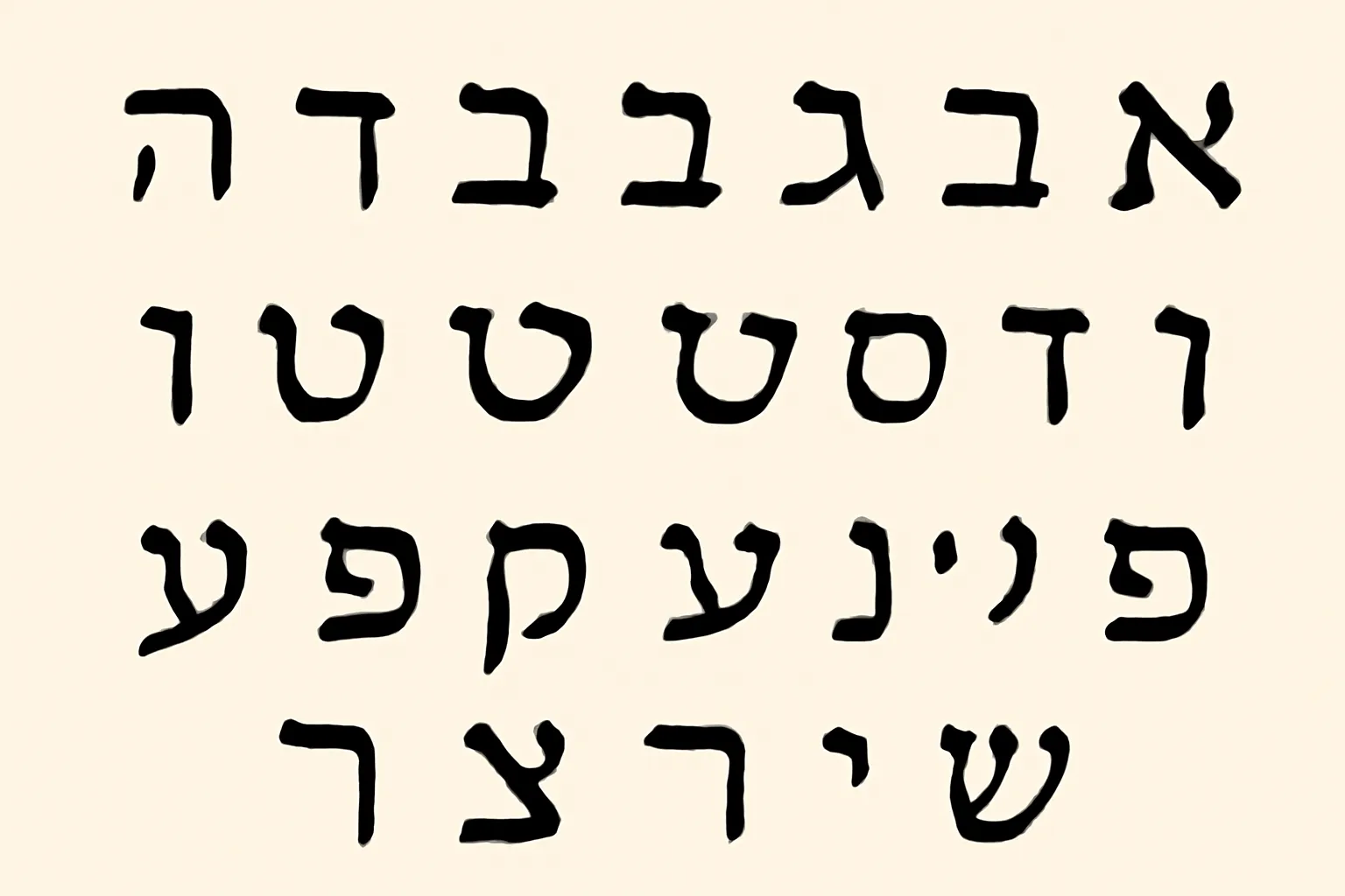
The following guide blends practical description with tips for forming each letter in cursive. Hebrew letters do not have uppercase forms, but they do transform in cursive to smoother, connected shapes. Below, we provide the name, sound, and practical writing cues for each letter. For learners, we highlight common pitfalls and drills you can incorporate into your routine. Language learners may notice that some letters look substantially different from their block counterparts when written in cursive; the key is to practice the curves and flows until they become familiar.
Aleph
Name and sound: Aleph is a glottal stop in many contexts and often behaves as a silent letter when used in certain words; it can carry vowels in practice texts. In cursive, Aleph usually appears as a small, delicate stroke or a soft loop at the start of a word, sometimes resembling a tiny hook or a vertical line with a curvature that tapers off.
Shape cues: Very light initial stroke or a tiny vertical with a subtle leftward hook; often connects smoothly to the next letter.
Common errors: Overstating the initial stroke; making Aleph look like a separate dot or an independent character rather than a connector.
Tips: Practice starting from the line with a light touch; aim for a minimal hook that merges into the subsequent letter in a single motion.
Drill: Write Aleph in sequences at the start and end of words to train its subtle, almost invisible presence in cursive.
Name and sound: Bet represents /b/ in its dagesh form and /v/ without a dagesh. In cursive, the dagesh is not a separate dot; instead, the letter’s boldness or heaviness changes, while the shape remains streamlined.
Shape cues: A rounded stroke that often begins with a small vertical or diagonal line and arcs into a bowl-like form.
Common errors: Leaving the dagesh entirely unindicated in cursive; forgetting the cross-stroke that differentiates /b/ and /v/ sounds in writing practice when needed.
Tips: Learn the basic loop first, then practice the light-to-dark pressure change that suggests the presence of a soft or hard sound in connected writing.
Drill: Write Bet in common words and short phrases to build familiarity with its connection to the next letter.
Gimel
Name and sound: Gimel sounds like /g/ as in “go.” In cursive, Gimel is often a single stroke that curves toward the left and then loops forward to connect to the next letter.
Shape cues: A single, flowing arc with a small tail that may connect to the following letter in a gentle upstroke.
Common errors: Breaking the stroke into two parts; creating an abrupt stop that interrupts the flow.
Tips: Keep the arc as a single continuous motion; let the tail guide into the next letter without lifting the pen.
Drill: Practice Gimel in start-internal and end-internal positions to ensure fluidity in sequences.
Dalet
Name and sound: Dalet has a soft, open shape and can resemble a small door-like form in cursive. It often transitions into the next letter with a gentle forward sweep.
Shape cues: A vertical line with a slight curve and an open space on the bottom-right that connects to the next letter.
Common errors: Overemphasizing the vertical stroke and losing the open doorway feel of the letter.
Tips: Keep the vertical stroke light and let the downstream stroke complete the doorway-like appearance.
Drill: Do sequences like Dalet–Lamed to emphasize smooth connections.
Hei
Name and sound: Hei represents /h/ and often appears as a simple, open-ended stroke in cursive, frequently starting with a small loop or hook.
Shape cues: A curved stroke that ends with a small escarpment or open loop.
Common errors: Making the final stroke too abrupt; forgetting the light, open ending that signals the breathy /h/ sound.
Tips: Practice a gentle loop that leads into the next letter; avoid tacking on heavy strokes at the end.
Drill: Pair Hei with vowels to practice keeping the shape light and airy.
Vav
Name and sound: Vav is the consonant /v/ and also functions as a vowel carrier (often turning into /o/ or /u/ with vowels). In cursive, Vav is typically a simple vertical stroke that can become a connecting pivot.
Shape cues: A straight vertical line or a slightly curved stroke, sometimes with a top or bottom loop depending on adjacent letters.
Common errors: Making the stroke too thick or too short, causing disconnection from the neighboring letters.
Tips: Keep Vav clean and straight for most words; use a slight bend only when needed to connect to the next letter.
Drill: Practice Vav as a hinge between vowels and consonants in common phrases.
Zayin
Name and sound: Zayin sounds like /z/ and often has a characteristic small crossbar or hook on certain cursive variants. In many styles, it has a short, snappy shape that integrates with neighboring letters.
Shape cues: A short horizontal stroke that may be followed by a small downward curve.
Common errors: Over-lengthening the crossbar or making the letter look disconnected.
Tips: Keep the horizontal stroke compact; let the downward stroke flow into the next letter.
Drill: Do Zayin in the middle of simple words to practice its linking behavior.
Chet
Name and sound: Chet represents a voiceless fricative /kh/ (like the loch in Scottish English) and is a robust, rounded letter in cursive. It often features a pronounced arch or loop.
Shape cues: A rounded loop that starts with a short vertical or diagonal stroke, then loops to form a broad curve.
Common errors: Flattening the loop, which reduces the distinctive curved silhouette.
Tips: Emphasize the outer curve; keep the loop smooth and continuous.
Drill: Practice CHET in sequences that require strong connections, like word-initial and word-medial positions.
Tet
Name and sound: Tet is /t/ and in cursive often appears with a compact, closed form that resembles a rounded square or loop integrated into the word.
Shape cues: A rounded form with a closed loop that connects to the next letter without abrupt corners.
Common errors: Leaving gaps between Tet and the following letter; making the shape too angular.
Tips: Maintain a gentle curve, and practice connecting Tet to a following Vav or Yod to feel the flow.
Drill: Combine Tet with vowels and common suffixes to reinforce its neighbor connections.
Yod
Name and sound: Yod sounds like /j/ or acts as a vowel marker. In cursive, Yod is a tiny, high stroke that often serves as a seed or pivot for later letters.
Shape cues: A small upstroke that may resemble a leftward dot or a short tail.
Common errors: Oversizing Yod or misplacing it so it interrupts the flow of the word.
Tips: Treat Yod as a subtle starter; keep it small but intentional for good linkage.
Drill: Practice Yod in words with multiple vowels to see how it influences subsequent letters.
Kaf and Khaf (Kaf sofit and Khaf forms)
Name and sound: Kaf typically sounds like /k/ and may be realized as kh in certain positions. In cursive, Kaf and its soft/khaf variants can look like a rounded bowl with a tail.
Shape cues: A loop or bowl shape with a tail curving to connect to the next letter.
Common errors: A stiff, blocky look that breaks the word flow.
Tips: Aim for a continuous arc that closes a soft bowl; for Khaf, introduce a slightly more lifted final stroke to differentiate from Kaf.
Drill: Practice Kaf and Khaf in mixed word sequences to understand how their shapes adapt when connected.
Name and sound: Lamed has a tall, graceful form with a distinctive tail that often curls to the left or upward in cursive; it frequently carries the vertical stroke into the next letter.
Shape cues: A long vertical stroke ending in a small flourish or hook that leads into the following letter.
Common errors: Shortening the vertical stem; failing to emphasize the tall, elegant line that defines Lamed.
Tips: Practice the tall stroke slowly, then connect to the next letter with a fluid bow-like curve.
Drill: Write Lamed at the beginning of words and in the middle to feel how it anchors the word visually.
Mem and Mem Sofit
Name and sound: Mem corresponds to /m/, and Mem Sofit is its final form used only at the end of words. In cursive, Mem often forms a rounded loop or a mouth-like shape; Mem Sofit has a distinct closed form when used as the last letter in a word.
Shape cues: The normal Mem is a rounded loop; Mem Sofit closes off with a final, sometimes more compact curve.
Common errors: Confusing Mem with final Mem; failing to close properly in final position.
Tips: Memorize the end-of-word shape separately and practice reading it as you write your own words.
Drill: Write several short words ending in Mem Sofit to emphasize its distinct final form.
Name and sound: Nun sounds /n/ and, like Mem, has a final form Nun Sofit used only at word end. In cursive, Nun typically has a straight or slightly curved stem with a bowl-like characteristic, and Nun Sofit closes with a rounded tail.
Shape cues: A simple vertical stroke with a small rounding at the bottom; final Nun ends in a loop or dot-like finish.
Common errors: Inconsistent height; forgetting the final form in word endings.
Tips: Distinguish Nun Sofit by practicing end-word compositions separately from initial forms.
Drill: Practice in short phrases that require word-final Nun Sofit to reinforce recognition and formation.
Samekh
Name and sound: Samekh is a /s/ sound and has a stable circular form in cursive that often sits neatly on the baseline with a graceful loop.
Shape cues: A round loop with a smooth interior, connecting to the following letter via a gentle arc.
Common errors: Flattening the circle; breaking the curve into two segments.
Tips: Think of Samekh as a rounded bead; keep its loop intact while joining to the next letter.
Drill: Use it in simple words to train a continuous, stable loop within connected writing.
Ayin
Name and sound: Ayin is a vowel-less consonant that often appears as a small, rounded hook or loop in cursive, frequently combining with vowels in practice texts.
Shape cues: A small, circular or oval loop that can connect to the next letter with a soft stroke.
Common errors: Overemphasizing the loop; making Ayin look like a separate symbol rather than part of a connected word.
Tips: Let Ayin ride on a tiny curve and join seamlessly into the following letter; avoid stiff, isolated shapes.
Drill: Practice Ayin in the middle and end positions to feel how it breathes with neighboring letters.
Pe and Pe Sofit
Name and sound: Pe represents /p/ in its dagesh form and /f/ without it. In cursive, Pe is often written with a distinctive bowl and a trailing tail that links to the next letter; Pe Sofit appears only at word end with a closing shape.
Shape cues: A rounded bowl with a stem that carries into the next letter; the final form is compact and closed.
Common errors: Inconsistent ending; leaving the final form unclosed in word endings.
Tips: Maintain a smooth arc from the bowl into the next letter; for the final form, ensure a neat closure that matches your word’s ending.
Drill: Write Pe in simple phrases and then finish with Pe Sofit to reinforce end-word consistency.
Tzadi
Name and sound: Tzadi sounds like /z/ combined with a sibilant; in cursive, it often has a tall stem and a graceful final tail that curves into the next letter.
Shape cues: A tall vertical line that may bend into a long, curling tail at the bottom or to the right to connect.
Common errors: Not extending the tail enough; giving it a stub that breaks the word’s rhythm.
Tips: Ensure the tail sweeps gracefully into the following letter; keep the stem tall and steady.
Drill: Practice Tzadi in words with multiple syllables to maintain flow and legibility.
Qof
Name and sound: Qof sounds like /k/ but with a uvular place of articulation; in cursive, Qof can appear as a bold, rounded shape with a slight hook at the end.
Shape cues: A rounded bowl that ends with a small hook; connects smoothly to the next letter.
Common errors: Over-emphasizing the hook; making the letter look top-heavy.
Tips: Focus on a balanced bowl and a subtle hook that fits into the word’s overall rhythm.
Drill: Include Qof in a variety of word positions to learn how its hook behaves in different contexts.
Name and sound: Resh is /r/ and in cursive often takes a rounded, arching form that leans forward slightly.
Shape cues: An arched stroke that curves toward the baseline and transitions smoothly into the next letter.
Common errors: Rushing the arch or creating a sharp corner that disrupts the line.
Tips: Let the arch speak for itself; aim for a soft, continuous curve that leads into the following letter.
Drill: Practice Resh in initial and medial positions to ensure the arch remains natural across words.
Shin and Tav
Name and sound: Shin carries the /sh/ sound and Tav is /t/; in cursive, both letters tend to run together with short stems and distinct endings depending on neighboring letters.
Shape cues: Shin often includes a small top or side feature; Tav ends with a clean, small curved tail.
Common errors: Blurring the top features so letters look identical; misplacing the ending stroke.
Tips: Practice the identifying features of each letter’s top or tail; connect to the following letter with a subtle, even stroke.
Drill: Create practice sequences that pair Shin and Tav with vowels for fluent word-building.
To maximize results, combine technique with strategy. The following tips help you progress methodically and keep your practice joyful and productive:
Set realistic goals: Define small, achievable targets for each week—e.g., “write all 22 letters in cursive on one line with clean connections.”
Use a progression model: Start with guided tracing, move to controlled writing, then freehand composing in short phrases.
Emphasize legibility over speed at first: Speed will come naturally as you gain confidence in the shapes and connections.
Record your progress: Take weekly samples of your handwriting to observe improvements in consistency, spacing, and stroke quality.
Limit distractions: Practice in a calm environment to maintain steady hand control and better letter formation.
Incorporate content: Practice writing your own name, common phrases, or short sentences to apply your learning in real contexts.
Seek feedback: If possible, have a teacher, tutor, or native reader review your handwriting and offer specific suggestions.
Digital and printable resources to support your journey
There are many resources to supplement your practice, from printable worksheets to digital tracing apps. Consider these options to diversify your routine:
Printable worksheets: Look for lined Hebrew cursive worksheets that show baseline, midline, and descender zones to reinforce proper proportions.
Tracing apps: Use tablet apps with pressure sensitivity to mimic real writing and refine stroke control.
Video demonstrations: Visual tutorials can help you observe stroke order and connection nuances that are hard to capture in text alone.
Word banks and practice sentences: Build your vocabulary and practice writing in context by including nouns, verbs, and common phrases.
Variations in Hebrew cursive handwriting
Not all cursive forms are identical. Across communities and regions, there are stylistic differences that reflect tradition, education, and personal taste. Here are some common variations you might encounter:
Israelite school cursive: Tends to emphasize clean, legible shapes with a focus on consistent spacing and a smooth, controlled flow. This is the style most learners encounter in Israeli classrooms.
Ashkenazi-influenced cursive: May display slightly different swoops or loops, with subtle adaptations to letter connections that reflect diaspora writing styles.
Calligraphic or stylistic cursive: In some contexts, learners or professional writers practice more decorative cursive forms, using longer tails, more pronounced loops, and personal flourishes for emphasis or aesthetic effect.
Modern mixed handwriting: People often blend print familiarity with cursive flows, keeping letters distinct enough for quick reading while maintaining a connected rhythm.
Regardless of the variation you encounter, the core principle remains: practice the letter shapes, maintain steady spacing, and ensure smooth connections between letters. You can adopt a specific style as your baseline and gradually incorporate subtle personal refinements that suit your writing needs.
Building a long-term practice plan
A robust plan helps you progress steadily without losing motivation. Here is a practical, long-term framework you can adapt to fit your schedule:
Phase 1 (weeks 1–2): Focus on letter shapes, basic stroke order, and single-letter drills. Practice each letter in isolation, then in simple two-letter sequences.
Phase 2 (weeks 3–6): Practice basic word patterns and short phrases; emphasize smooth connections between letters and consistent spacing.
Phase 3 (weeks 7–12): Add full words, sentences, and dictated text. Start using content relevant to your interests (e.g., personal notes, class worksheets).
Phase 4 (weeks 13+): Fine-tune legibility, develop a personal handwriting style, and explore calligraphic variations for special projects or formal writing.
Measuring success and staying motivated
Tracking progress helps you stay motivated and identify areas for focused practice. Consider these strategies for measuring success:
Regular samples: Every week, write a short paragraph in cursive and compare it with a baseline sample from several weeks earlier.
Readability tests: Have a friend or teacher read your sample without context to judge legibility and letter recognition.
Consistency metrics: Track consistency of letter height, baseline alignment, and the smoothness of connections.
Behavioral goals: Set practical targets like “two pages of clean cursive notes per week” or “trace for 15 minutes daily.”
Common mistakes and how to fix them
Even experienced writers encounter recurring challenges. Here are some typical issues and corrective strategies:
Inconsistent letter size: Use ruled guides and practice a fixed x-height for all letters to achieve coherence.
Weak connections: Focus on joining strokes smoothly; practice by writing pairs of letters in repetitive loops to establish confidence in transitions.
Pen lifts that break rhythm: Reduce the number of lifts by planning the word as a single motion, with a mindful pause at the end of a word rather than within it.
Uneven pressure: Practice with a metronome-like rhythm and adjust your grip to avoid gripping too hard; aim for consistent pressure throughout a line.
Conclusion: embracing the journey of Hebrew cursive
Learning Hebrew Aleph Bet Cursive is a practical, creative journey. It blends motor memory with linguistic knowledge, enabling you to read and write more fluently in daily life, in academic settings, and in personal communication. While there are many stylistic variations, the core idea remains the same: train your hand to move smoothly, respect the baseline and letter connections, and practice regularly. By following the structured guidance in this article—covering fundamentals, letter-by-letter strategies, and long-term practice plans—you can develop a confident, legible, and personal cursive style that serves you well across contexts.
If you’re starting today, here’s a simple starter routine you can adapt right away:
Remember, the key is consistency and mindful practice. With time, your Hebrew cursive handwriting will become a reliable, expressive tool in your linguistic toolkit.