Hebrew calligraphy is a living tradition that spans sacred presses, classroom desks, and contemporary art studios. It encompasses carved letters on parchment, elegant manuscript scripts, and bold, graphic lettering used in posters, branding, and wedding Ketubot. This guide explores the styles, tools, and techniques that shape Hebrew calligraphy from ancient scribal arts to modern hand-lettering. Whether you are seeking to inscribe a Torah scroll with traditional precision, or to create a contemporary Hebrew typographic logo, understanding the range of scripts, their origins, and practice routines will deepen your work and your appreciation for this ancient craft.
Calligraphy is the art of drawing letters with controlled strokes and deliberate rhythm. In Hebrew, calligraphy sits at the intersection of divine tradition and personal expression. Some writing must adhere to halachic standards—for example, the Torah scrolls, tefillin, and mezuzot require a highly specific form known as Ktav Ashuri. Other modes, like Rashi script or modern Hebrew hand-lettering, are open to stylistic experimentation and artistic interpretation. The result is a spectrum, from sacred law to expressive design, that invites both discipline and invention.
Historical overview of Hebrew writing and calligraphy
Hebrew writing has a long and layered history. The evolution of letterforms reflects cultural exchange, liturgical needs, and evolving printing technologies. A few anchors help orient a student of Hebrew calligraphy:
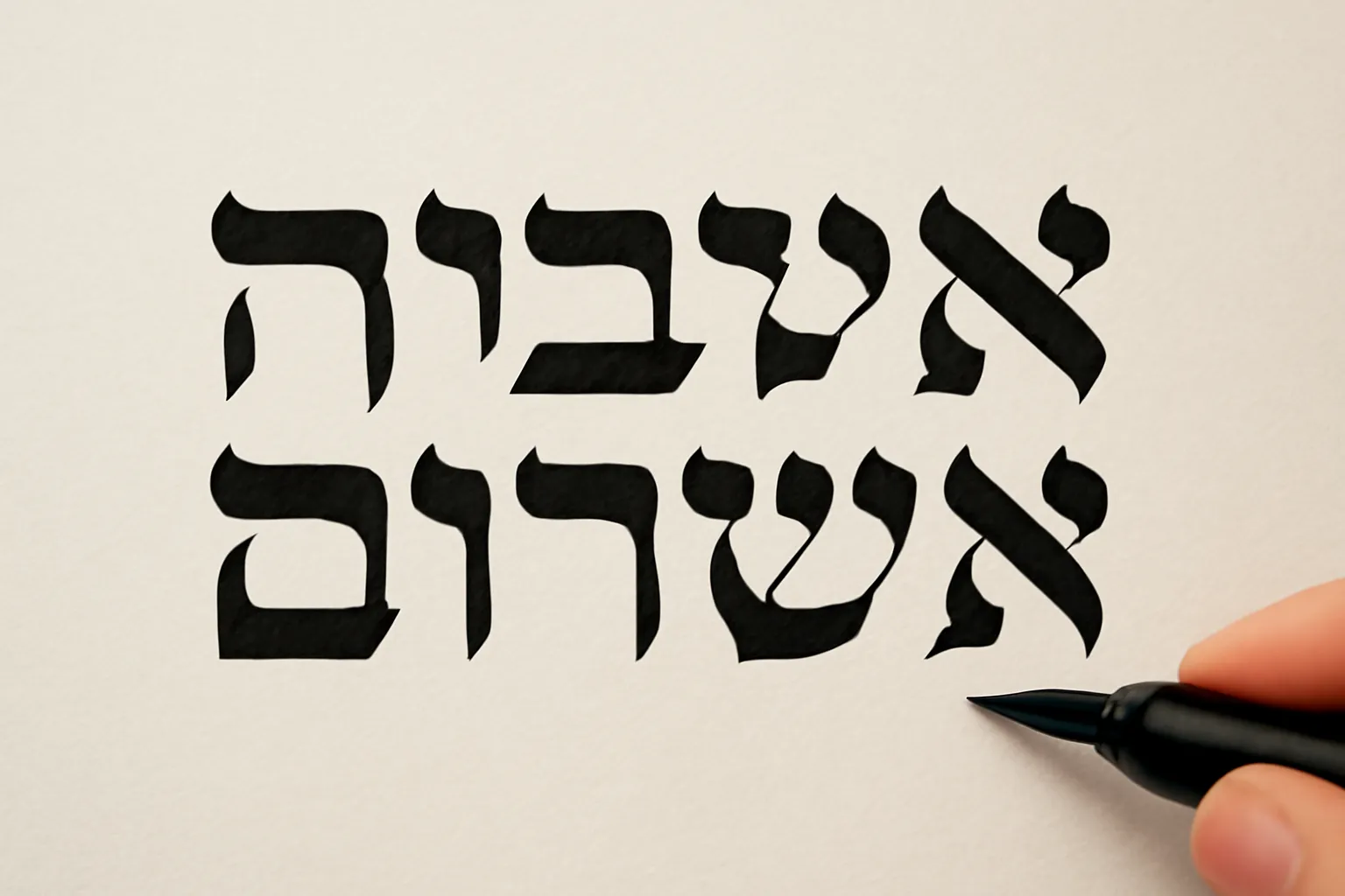
Ktav Ashuri (Square or Block Script): the canonical form used for the Torah, tefillin, mezuzot, and modern Hebrew printing. Its rectilinear strokes and uniform density are designed for legibility and ritual accuracy.
Rashi script (a semi-cursive script named after Rabbi Shlomo Yitzchaki): historically used for rabbinic commentaries and marginalia in printed editions. It has a distinctive rounded, looping quality that differentiates it from the square script.
Sephardic vs. Ashkenazi handwriting traditions: regional scribal styles that informed decorative letters, cantillation marks, and layout conventions in manuscripts and early printed books.
Sofrut tradition: a specialized scribal practice for sacred texts that emphasizes precise letter proportions, uniformity, and ritual purity in the act of writing a Torah scroll or mezuzah.
Across centuries, calligraphers borrowed tools and ideas from neighboring arts—Islamic geometric ornament, medieval Latin scripts, and later European print styles—yet Hebrew calligraphy retained a distinctive discipline rooted in linguistic rhythm and liturgical purpose. In modern times, artists blend these inherited forms with personal handwriting, typography, and brushwork to create new Hebrew lettering idioms.
Core scripts and styles in Hebrew calligraphy
There are several major families of Hebrew lettering, each with its own aesthetic and technical considerations. Here are the most commonly encountered:
Ktav Ashuri (Square Script)
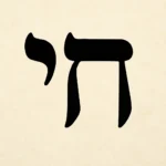
Often called the Square Script, Ktav Ashuri is the standard form for sacred Jewish texts and for modern Hebrew printing. Its features include straight lines, sharp angles, and letterforms that fit neatly in a grid. The script is designed for high readability and durability in writing surfaces like parchment and parchment substitutes. For calligraphers, mastering straightness, consistent x-height, and careful spacing between letters (tracking) is essential. This is the script you most commonly encounter on Torah scrolls, tefillin compartments, and mezuzot, as well as in many formal Hebrew typographies.
Distinctive letters include: aleph, bet, gimel, dalet, and the characteristic tagim (crown-like accents) on certain letters in scribal practice.
In tattooed or decorative contexts, some artists soften corners or add subtle serifs, but the canonical form remains recognizable as Ktav Ashuri.
Rashi Script
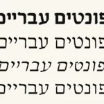
Rashi script is not a functional handwriting style for sacred text; rather, it is a decorative, semi-cursive script commonly used in rabbinic commentaries and sometimes in children’s books and popular Hebrew literature. Its curves and loops give it a lively, human feel, standing in contrast to the austere straight lines of square script. In modern typography, Rashi script is invoked to evoke tradition, scholarship, and rabbinic authority. Calligraphers who work in Hebrew often study Rashi script to understand how letterforms can be simplified or embellished while staying legible in print-like proportions.
Rashi letters typically have more rounded shapes and a tighter overall texture than square script.
Stroke connections are looser, giving a sense of motion and fluency across the line.
Common uses include headings, marginal notes, and decorative initial letters in liturgical or educational books.
In addition to the strict, ritual-focused scripts, historical handwriting styles developed across Jewish communities. The Sephardic tradition often features more fluid strokes and can incorporate ornamental elements influenced by broader Mediterranean calligraphy. The Ashkenazi handwriting tradition—from Central and Eastern Europe—tends to emphasize immediacy and legibility, with practical forms that were used by scribes, scholars, and teachers alike. Today, many designers draw inspiration from both traditions to create unique pieces that honor origin while solving contemporary design problems.
Sofrut-centric scripts and decorative lettering
In the scribal arts, Sofrut refers to the broader field of Hebrew sacred writing, including the precise letter shapes used in Torah scrolls and other ritual objects. Decorative variants within Sofrut include elongated strokes, stylized crowns, and accent marks that convey solemnity and ceremony when appropriate. Contemporary calligraphers sometimes create canvas pieces or wall art that blend ceremonial forms with abstract composition, producing pieces that feel both ancient and contemporary.
Modern Hebrew calligraphy: styles and trends
Beyond the sacred and traditional scripts, modern Hebrew calligraphy embraces experimentation and cross-cultural influence. Calligraphers work with brushes, markers, and digital tools to produce anything from minimalist letterforms to lush, layered compositions. Here are several common directions you may encounter:
Brush lettering in Hebrew blends broad-stroke brush work with careful control of weight and rhythm. This approach yields expressive letters with natural variations in thickness, similar to English brush calligraphy but adapted to the Hebrew alphabet.
Geometric and sans-serif Hebrew applies the logic of modern typography to hand lettering. Letters are pared down to essential strokes, with emphasis on spacing, balance, and negative space.
Ornamental and decorative Hebrew uses flourishes, ligatures, and ornamental elements borrowed from other scripts (Arabesque motifs, for instance) to create pieces that feel ceremonial and celebratory.
Experimental or hybrid scripts combine elements from Ktav Ashuri, Rashi, and contemporary street typography to address logos, posters, and editorial design.
Tools for Hebrew calligraphy
Choosing the right tools shapes what you can express in Hebrew calligraphy. Tools influence the stroke quality, line tension, and overall character of your letters. Below is a practical toolkit, from traditional to contemporary:
Writing implements
Reed pens (klei) and wood- or bamboo-based nibs: create crisp, angular strokes ideal for Ktav Ashuri and formal inscriptions.
Qalam (Arabic-style reed pen) used with black ink for expressive line variation; well-suited to brush-like Hebrew scripts.
Metal nibs and dip pens: enable precise lines and controlled ink flow for square script and fine details in Rashi script adaptations.
Brushes (synthetic or natural): offer the broad-to-narrow stroke range needed for brush lettering in modern Hebrew hand-lettering.
Pencils and graphite for guidelines and layout sketches before inking.
Markers and felt tips with broader nibs are useful for posters, signage, or quick study of proportions.
Ink, paint, and color
Black ink remains the standard for traditional scripts, valued for its density and archival qualities.
Colored inks and metallics (gold, copper) bring elegance to decorative pieces, manuscripts, and Ketubot-inspired art.
Watercolors, gouache, and acrylic inks can be used for layered textures, especially in brush lettering projects.
For sacred work, some practitioners select inks that are stable on parchment or paper and comply with local guidelines for ritual texts.
Paper and surfaces
Parchment and parchment-like papers carry traditional resonance for liturgical writing and calligraphy projects that echo ancient scrolls.
Rag paper and cotton-based papers offer durability and smoothness for ink formulations used in calligraphy.
Watercolor paper or bristol board can support brush lettering and mixed-media Hebrew projects.
Planning surfaces with light gridlines or layout guides helps maintain consistent baseline alignment and letter height.
Guidelines for baseline, x-height, and ascenders/descenders are essential for square script and for maintaining even rhythm in other styles.
Employing light ruling or grid paper in early studies helps you internalize proportion before committing to ink.
For multi-line compositions, consider a modular grid system so that each line aligns in a coherent block.
Techniques and practice: how to build Hebrew calligraphy skills
Developing fluency in Hebrew calligraphy requires deliberate practice, a mindful approach to strokes, and an understanding of letter proportions. Here is a practical pathway you can follow, whether you are a beginner or revisiting the craft after a hiatus:
Foundational strokes and letter shapes
Begin with the basic strokes that recur across most Hebrew letters, such as verticals, horizontals, and essential curves. Practice these in isolation before joining them into complete letters. A few tips:
Study how each letter’s stroke order influences the final form and legibility.
Keep your pen at a consistent angle to produce uniform thick and thin lines, especially with broad-nib or brush work.
Work on alignment by using light guidelines to keep a steady baseline and uniform height across rows of text.
Proportions, spacing, and rhythm
Proportions determine how a sheet of Hebrew text reads. The key elements to master include:
x-height: the height of the lowercase (or short) letters relative to the baseline.
Ascenders and descenders: the vertical extents above and below the baseline, which affect rhythm and readability.
Inter-letter spacing (tracking) and inter-word spacing: crucial for clean, legible lines, especially in square script.
Line spacing (leading) and margins: contribute to a balanced composition, particularly on ceremonial pages and posters.
From rough sketch to finished piece
Process-oriented practice can help you translate a plan into a refined output. A common workflow:
Sketch the composition lightly with a pencil, marking major letters and the rhythm of lines.
Ink the letters with your chosen tool, maintaining consistent pressure to control line weight.
Apply any decorative elements (ornamentation, ligatures, or initial capitals) after the base letters are dry.
Review for balance: adjust spacing and line breaks to achieve visual harmony across the page or canvas.
Letter-specific guidance
While there are hundreds of Hebrew letters, here are some core notes for a few frequently used forms in calligraphic practice:
Aleph and Hey often feature a delicate top stroke and can be elongated for grace in decorative work.
Bet and Kaf may be written with a full, enclosed loop in certain styles; decide early whether your piece emphasizes closed forms or open forms.
Gimel and Daleth can be approached with a slightly heavier right stroke to emphasize their angular nature in square script.
Letters with final forms (menaḥ, kaf sofit, mem sofit, nun sofit, etc.) often demand careful treatment to preserve legibility while achieving elegance.
Projects and applications: where Hebrew calligraphy shines
Hebrew calligraphy is not limited to a single setting. Its versatility makes it suitable for a wide range of projects, from sacred to secular. Consider these applications:
Ketubah design: uses decorative lettering, ornate borders, and layout planning to commemorate a wedding with beauty and tradition.
Mezuzah and tefillin parchment art: demands high respect for script integrity, but can be artistically framed in decorative contexts outside the parchment itself.
Poster art and typography: a modern space for blending Ktav Ashuri precision with expressive brushwork or digital lettering.
Ceremonial invitations and certificates: often call for a blend of formality, legibility, and a touch of flourish in initials.
Educational materials: posters, worksheets, and classroom assets that teach Hebrew letters through visually engaging calligraphy.
Home decor and gallery pieces: allows for experimentation with color, texture, and mixed media while honoring the structure of Hebrew letters.
Preservation, care, and learning pathways
To sustain your skills and ensure the longevity of physical pieces, consider these practical aspects:
Preservation of inked work: keep pieces away from direct sunlight and excessive humidity to prevent fading or warping of paper or parchment.
Tool maintenance: rinse nibs and brushes after use to prevent rust or dried ink buildup; store flat or upright as recommended by tool type.
Learning pathway: begin with foundational scripts (Ktav Ashuri and Rashi) before exploring decorative or modern hybrids.
Community and mentorship: join local calligraphy workshops or online forums to share work, receive feedback, and learn from others’ approaches.
Here are approachable practice activities you can try, whether you’re in a studio, classroom, or home workspace. These are designed to build muscle memory and confidence in Hebrew lettering:
Stroke drills: draw straight lines, then add short perpendicular strokes to form basic letter shapes. Focus on even pressure and steady hands.
Alphabet sampler: write each letter in Ktav Ashuri at a single size, then do a parallel pass where you add a slightly feathered variation on stroke ends for visual interest.
Rashi-style practice: pick a letter pair and render them in a Rashi-inspired form with soft curves, then compare readability with the square script version.
Composition studies: design a small plaque or card with a short phrase in Hebrew. Experiment with line breaks, initial caps, and decorative flourishes to study balance.
Decorative initial capitalization: create a large, ornate initial letter in a traditional or modern style to anchor a short passage.
Resources and learning further
If you’d like to deepen your study of Hebrew calligraphy, many resources are available. Look for a mix of foundational texts, online courses, and community workshops that emphasize both technique and cultural context. Consider the following avenues:
Books on traditional Hebrew calligraphy and Sofrut practices that cover letter structures, ink types, and ritual rules.
Online video tutorials that demonstrate inking techniques, nib control, and layout planning for different scripts.
Practice sheets and templates for Ktav Ashuri and Rashi script, with guides for spacing and proportion.
Exhibitions and gallery shows featuring contemporary Hebrew lettering to observe how artists integrate tradition with modern design.
Communities and guilds that offer critique, support, and collaborative projects for Hebrew calligraphy practitioners.
A concise glossary of terms you’ll encounter
Building a strong vocabulary helps you discuss techniques, styles, and projects with peers. Here are key terms you’ll likely encounter:
Ktav Ashuri — the square script used for sacred Hebrew texts and modern printing.
Rashi script — a semi-cursive style used mainly in rabbinic commentary and decorative contexts.
Sofrut — the broader discipline of scribal Hebrew writing, including theoretical rules and practical practices for sacred texts.
Line weight — the thickness of strokes, crucial for expressing rhythm and emphasis in calligraphy.
Baseline — the horizontal line on which most letters sit, establishing alignment and uniformity.
Proportion — the relative height and width of letters, ensuring consistency across a line or page.
Conclusion: embracing the breadth of Hebrew calligraphy
Hebrew calligraphy offers a remarkable convergence of heritage, craft, and creative expression. From the solemn precision of Ktav Ashuri used in sacred scrolls to the curvilinear charm of Rashi script, and onward to the vibrant experimentation of modern brush lettering, Hebrew calligraphy invites you to study the rules, understand the history, and push your own boundaries. Whether your aim is to preserve a ritual tradition with exacting care or to produce a bold, contemporary piece that communicates warmth and meaning, the practice is fertile and endlessly adaptable. The complete guide to styles, tools, and techniques is not a fixed map but a living conversation—one that you contribute to every time you pick up a pen, brush, or nib and give shape to Hebrew letters with intention and beauty.
As you explore, remember that mastering Hebrew calligraphy is a journey of steady practice, mindful study of form, and thoughtful engagement with cultural and linguistic meaning. With patience, you can develop a handwriting that honors the past while speaking with clarity and artistry in the present. May your letters be clear, your ink steady, and your designs expressive—bridging tradition and innovation in the timeless script of Hebrew.