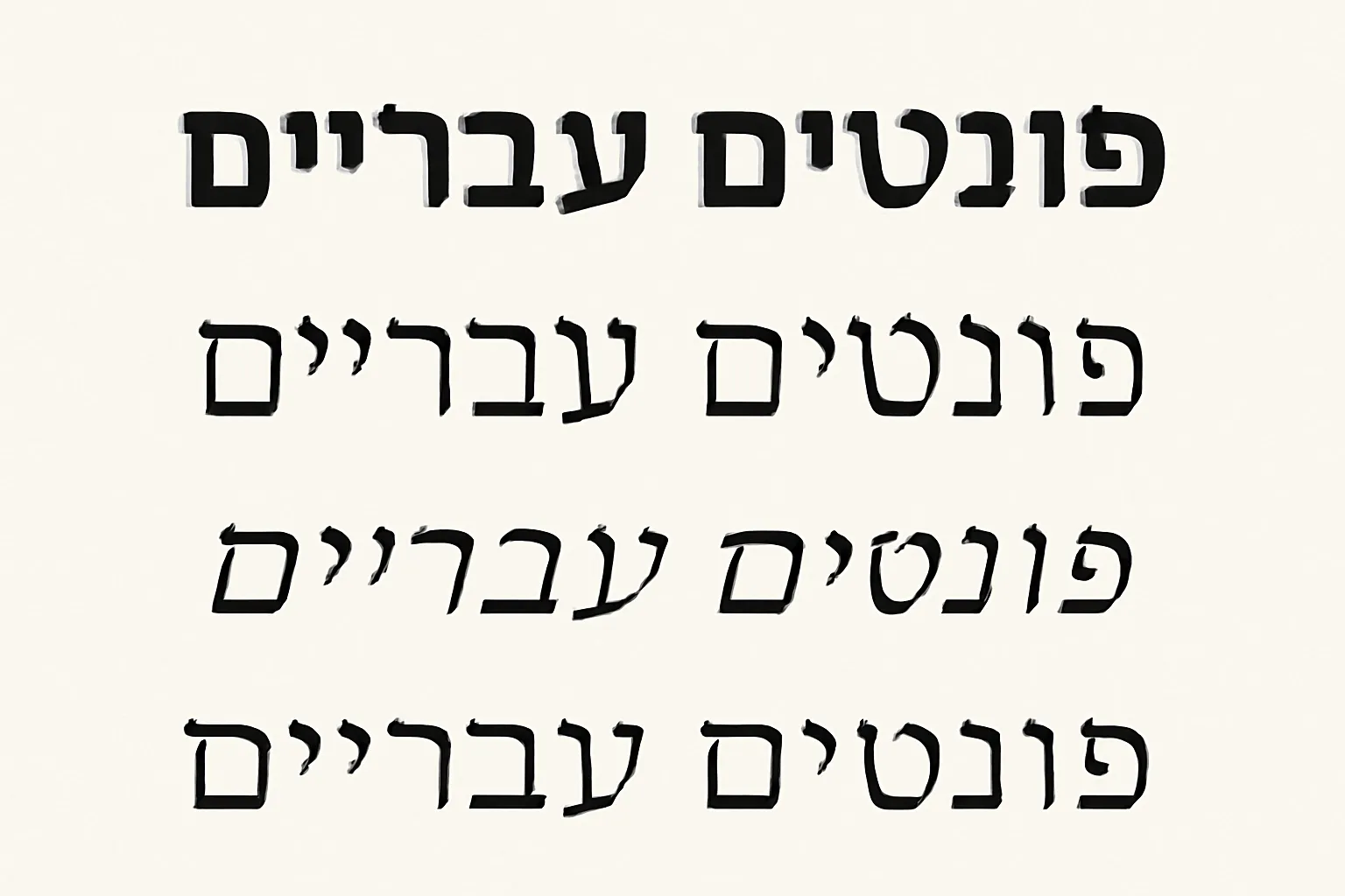
Welcome to the ultimate guide to Hebrew fonts. Whether you are designing for the web or preparing print materials, the choices you make for Hebrew typography—especially the selection of fonts—have a direct impact on readability, tone, and user experience. Hebrew is a right-to-left script with its own typographic conventions, diacritics, and historical forms. In this article, you will find an extensive overview of the varieties of Hebrew fonts, practical guidance for web and print applications, and concrete recommendations you can apply right away. We will cover core concepts, useful font families, pairing strategies, technical tips for implementation, and considerations for accessibility and licensing. This guide uses cross-frame references to both classic and contemporary typefaces to help you build a typography system that feels intentional and legible in any context.
Typography is not just about selecting a pretty face. For Hebrew, the directionality, glyph coverage, and diacritic handling (nicely called niqqud) are fundamental. A well-chosen Hebrew font communicates clarity and credibility, supports the page’s or screen’s rhythm, and respects the reader’s language-specific expectations. In the digital world, a font that renders correctly across platforms, supports ligatures and diacritics, and loads efficiently will contribute to accessibility, search engine clarity, and user engagement. In print, typography conveys tone—whether formal, warm, modern, or scholarly—and the font choice often drives the perceived quality of the material. A strong Hebrew font system combines readability with aesthetic resonance, and it should be designed to work with pairings, sizing scales, and layout constraints that are common to Hebrew typography.
Understanding Hebrew typography basics
Before diving into specific typefaces, it helps to be familiar with some core concepts that affect how Hebrew fonts behave in practice:
Right-to-left (RTL) layout: Hebrew text flows from right to left, and punctuation follows RTL rules. This affects how you structure text blocks, menus, and UI components.
Diacritics and cantillation: Many fonts support niqqud (vowel points) and cantillation marks used in liturgical and scholarly contexts. Not all fonts render diacritics with the same weight or spacing, so it’s important to verify diacritic coverage for your use case.
Kerning and spacing: Hebrew letters pair in ways that influence legibility, especially at smaller sizes. Some fonts offer refined kerning specifically for Hebrew pairs.
Glyph coverage: Beyond the basic alphabet, a robust Hebrew font family provides a full set of punctuation, numerals, and typographic marks, plus support for older or liturgical glyphs if needed.
Font metrics: The x-height, cap height, and baseline align with Latin counterparts differ between families. This matters when you mix Hebrew with Latin in the same design.
With these basics in mind, you can approach font selection with greater precision and avoid common pitfalls such as mismatched line height, inconsistent diacritics, or awkward spacing in multilingual layouts.
Categories of Hebrew fonts
Hebrew fonts, like Latin fonts, can be categorized by their intended use and visual tone. The main families you are likely to encounter include serif, sans-serif, display, and specialized or scholarly fonts. Each category has its own strengths for different contexts—web, print, branding, or academic work.
Serif Hebrew fonts
Serif Hebrew fonts typically convey a formal, traditional, or scholarly feel. They are well-suited for headlines, books, religious texts, and long-form print where a classic texture is desirable. Notable examples and family lines include:
Frank Rühl Libre: A modern revival of a historic Hebrew newspaper face, offering strong presence in body text and dignified display in headlines.
Cardo: A serif family designed for scholarly typography with strong diacritics support and extensive Hebrew glyph coverage.
SBL Hebrew (Society of Biblical Literature): A biblically oriented font often used in academic publishing, prized for its legibility at small sizes and its diacritics support.
Other classic-like serifs: Depending on the vendor, you may find additional Hebrew serif faces inspired by traditional print types, suitable for formal editions and religious texts.
Sans-serif Hebrew fonts
Sans-serif Hebrew fonts are versatile for modern interfaces, websites, and signage. They generally offer clean lines, neutral tone, and excellent legibility on screens. Popular sans-serifs for Hebrew include:
Alef: A contemporary sans for Hebrew that pairs well with other typefaces and works effectively on the web.
Noto Sans Hebrew (part of the Google Noto family): Broad glyph coverage, reliable rendering, and good legibility for interfaces and body text.
Heebo (Google Fonts): A modern sans that integrates well with multi-language layouts and performs well on the web.
Assistant (Google Fonts): A geometric sans with good readability for UI and headlines in Hebrew and English.
Other contemporary sans faces: Several foundries offer Hebrew-optimized sans families designed for high readability in digital environments.
Display and decorative Hebrew fonts
Display and decorative Hebrew fonts are designed to capture attention in headlines, posters, branding, or signage. They may feature distinctive shapes, playful letterforms, or ornate diacritics. Use them sparingly for titles, branding elements, or emphasis, and ensure they still support the needed Hebrew diacritics if used in interactive contexts. Examples include:
Narkisim: A distinctive display typeface often used for titles and poster work with strong character.
Other display families: Look for fonts that prioritize personality and can handle diacritics and Hebrew punctuation without sacrificing legibility at larger sizes.
Scholarly and biblical fonts
Scholarly typography for Hebrew often requires precise diacritic handling, robust cantillation sets, and reliable ligatures. These fonts are favored by academic publishers and researchers. Notable options include:
SBL Hebrew: A staple in biblical and linguistic typography, especially when diacritics and cantillation matter.
Cardo and Cardo variants (Latin + Hebrew): Widely used in scholarly contexts for its historical resonance and typographic depth.
Ezra SIL (where available): A font family with Hebrew support used in linguistic documentation and biblical studies.
Choosing fonts for web vs print
The needs of the web and print differ in important ways. Your font choices should reflect factors such as loading performance, accessibility, typography scale, and the kinds of devices readers use. Here are practical considerations for each medium.
Web fonts: performance, compatibility, and accessibility
Load performance: Subsetting to Hebrew glyphs, using font-display: swap, and choosing efficient font formats help deliver good initial rendering.
System fonts vs web fonts: For quick deployment, you can rely on system fonts with broad Hebrew support, and supplement with web fonts for branding elements or special sections.
RTL rendering: Ensure the font works well in RTL contexts and that CSS direction and Unicode bidirectional controls are correctly applied.
Diacritics and ligatures: Verify that the chosen font handles niqqud and cantillation cleanly, especially if you plan to display anything beyond plain Hebrew text.
Pairings: Pair Hebrew web fonts with complementary Latin fonts to maintain visual harmony across languages.
Print fonts: ink, readability, and reproduction
Print readability: Serif fonts often convey classic readability in long-form print; sans-serifs can work well for signage and brochures with bold headlines.
Glyph fidelity: In print, you may need to ensure accurate diacritic rendering at all sizes and high-contrast ink behavior.
Licensing for print: Check licenses for commercial printing, embedding, and distribution if your project is a book, brochure, or newspaper-like material.
Typography hierarchy: Establish a clear typographic scale (headlines, subheads, body text) and ensure your chosen fonts support the required weights and styles.
Key Hebrew fonts to know for web and print (with recommended use cases)
Below is a curated list of representative fonts that are widely used in Hebrew typography today. The aim is to offer options across categories and to illustrate pairing possibilities. Note that availability may vary by platform and license, so verify access before use.
Noto Sans Hebrew (sans-serif): Excellent for UI, websites, and multi-language pages; strong glyph coverage and reliable rendering across platforms.
Noto Serif Hebrew (serif): A good companion to Noto Sans Hebrew when you need a readable body text with a classic tone.
Alef (sans-serif): A contemporary Hebrew sans suitable for modern interfaces and branding materials.
Heebo (sans-serif): A versatile modern font that works well in multilingual layouts and responsive designs.
Assistant (sans-serif): Clean, geometric, and web-friendly; useful for interface copy and captions.
Frank Rühl Libre (serif): A robust, dignified serif option with historical resonance for print and editorial work.
Cardo (serif): Strong in scholarly contexts; reliable for academic publishing and translations with complex diacritics.
SBL Hebrew (serif): Scholarly staple for biblical and linguistic materials; excellent diacritics support and readability.
Narkisim (display): Bold display face appropriate for headlines and branding statements with distinct personality.
Miriam Libre (sans-serif, friendly tone): A widely used, legible option for body text and UI in creative contexts.
Font pairing strategies for Hebrew and Latin text
Pairing Hebrew and Latin typefaces effectively is essential for bilingual or multilingual designs. The goal is to achieve a harmonious rhythm, a clear hierarchy, and a cohesive mood across languages. Here are practical strategies to create resilient typographic systems:
Match x-heights: When pairing, consider the relative x-height and cap height of the Hebrew font and its Latin counterpart to avoid a jarring visual mismatch.
Consistent tone: Choose a Hebrew font and a Latin font that share a similar tonal character (e.g., both modern sans, or both dignified serifs) to maintain a unified brand voice.
Contrast for hierarchy: Use a serif Hebrew font with a sans-serif Latin font (or vice versa) to create a readable hierarchy while preserving legibility across languages.
Diacritics alignment: If your project includes diacritics in Hebrew and accented Latin characters, test diacritics alignment in headings and body text to avoid misalignment.
Display weights: Reserve the broader range of weights for display elements to avoid overloading body text and to keep the rhythm clean.
Some practical pairings you can experiment with include:
Noto Sans Hebrew + Noto Serif Hebrew for a clean, balanced web text system.
Alef + Cardo for a modern UI with a scholarly print feel in long-form content.
Heebo + SBL Hebrew when you need a contemporary interface paired with a biblically informed scholarly tone.
Practical tips for implementing Hebrew fonts on the web
Implementing Hebrew fonts on the web requires attention to detail beyond selecting a typeface. The following practical tips help ensure reliable rendering, fast loading, and good accessibility:
Use robust font stacks: When listing fonts in CSS, provide a sensible fallback chain that includes well-supported Hebrew fonts and a generic sans-serif or serif fallback. Example: font-family: «Noto Sans Hebrew», «Alef», «Assistant», system-ui, -apple-system, «Segoe UI», Roboto, Arial, sans-serif;
Subset intentionally: If you don’t need the entire character set, request or define a Hebrew subset to reduce file size and improve performance.
Directionality handling: Set direction: rtl on the container elements and ensure proper use of Unicode bidi controls where needed.
Font loading strategy: Use font-display: swap or fallback to avoid flashes of unstyled text (FOUT) while fonts load.
Accessible typography: Maintain a readable line length, comfortable line height, and adequate contrast. Test legibility on mobile devices and at various zoom levels.
Diacritics and typography: If your content uses niqqud, verify that the chosen font renders diacritics sharply at the intended sizes, especially for textbooks, liturgical texts, or linguistic material.
License awareness: Confirm licenses for web embedding, redistribution, and any commercial usage, especially for brand-critical projects.
Sample CSS typography setup for Hebrew web content
/* Basic, robust Hebrew typography stack for a multilingual site */
:root {
–hb-font: «Noto Sans Hebrew», «Alef», «Assistant», system-ui, -apple-system, «Segoe UI», Roboto, Arial, sans-serif;
–lb-font: «Noto Sans», «Arial», sans-serif; /* Latin fallback */
}
html {
direction: rtl;
}
body {
font-family: var(–hb-font);
font-size: 18px;
line-height: 1.6;
color: #222;
}
h2, h3 {
font-family: var(–hb-font);
}
Print considerations for Hebrew typography
When preparing materials for print, typography takes on physical constraints and production realities that differ from digital work. Here are essential considerations for print projects that feature Hebrew text:
Print legibility: Higher print resolution and precise ink behavior mean you can opt for slightly more ornate or robust letterforms in headlines while maintaining legibility in body text.
Glyph coverage: Ensure your chosen font covers all required Hebrew characters, diacritics, punctuation, and cantillation marks if your material is scholarly or liturgical.
Letraset and publishing workflows: For traditional publishing, check compatibility with the production workflow, including PDF workflows, prepress, and typesetting software.
Consistency with branding: If your organization uses brand fonts, confirm licensing for print and digital usage to maintain a consistent identity across media.
Common Hebrew font challenges and how to address them
Even experienced designers encounter issues when dealing with Hebrew fonts. Here are some common challenges and practical fixes:
Inconsistent diacritics: Test fonts with diacritics in the contexts where they will appear (educational materials, liturgy, or linguistics). If diacritics drift or collide with Latin glyphs in a bilingual design, consider adjusting line height or choosing a font with stronger diacritic control.
Poor pairing with Latin text: If your Hebrew text looks visually heavy or light next to Latin copy, tweak font weights, use a secondary font for UI labels, or adjust letter spacing to achieve harmony.
RTL UI elements: In interfaces, ensure that the Hebrew font integrates well with UI components like menus, placeholders, and icons. Test both navigation and content blocks for RTL coherence.
Loading performance: Web fonts can slow down pages. Optimize by selecting a few essential weights, enabling subsetting, and using modern formats (WOFF2) where possible.
Accessibility and legibility in Hebrew typography
Typography should enhance accessibility and legibility for Hebrew readers of all ages and abilities. Consider the following:
Contrast: Use sufficient contrast between text and background. For Hebrew body text, a darker text on a lighter background tends to be most readable in long-form content.
Line length and leading: For web text, aim for approximately 50-75 characters per line (including spaces) and adjust line height (leading) to 1.4–1.6 times the font size for comfortable reading.
Font size and scalable typography: Provide scalable font sizes and responsive typography so that readers on mobile devices can comfortably read without zooming.
Diacritics and readability: If you rely on niqqud, ensure the font maintains legibility at the intended sizes. In digital contexts, avoid overly tight diacritic placement.
Licensing and distribution considerations
Typography licensing can be a deciding factor in which fonts you can use, where you can use them, and under what conditions you can distribute your work. Some key points to keep in mind:
Open-source Hebrew fonts: Fonts like Noto Sans Hebrew and Noto Serif Hebrew are open-source and widely used in both web and print contexts. They typically allow broad usage, including commercial.
Proprietary fonts: Commercial fonts (or fonts from specific foundries) may require purchasing licenses for web embedding, desktop usage, or print production. Always review the license terms for redistribution and embedding limits.
Font hosting and embedding: If you plan to host fonts yourself (via @font-face), verify that the license permits desktop and web embedding. Some licenses differentiate between on-device use and web embedding.
Brand and typography systems: For brand-critical projects, you may need a custom or bespoke Hebrew font, or a carefully licensed family, to protect brand consistency across media.
Practical workflow: building a Hebrew typography system
To help you translate this knowledge into a repeatable workflow, here is practical guidance for building a robust Hebrew typography system that works across media and platforms:
Define goals: Clarify whether the project is editorial, academic, branding, UI-focused, or signage-driven. Your priorities guide font selection and pairing.
Choose core families: Select a primary Hebrew font (for body text) and a secondary font (for headings or highlights). Consider pairing a sans with a serif for contrast when appropriate.
Confirm diacritics: If you need niqqud or cantillation, confirm that the chosen fonts provide robust diacritic support and test edge cases in your content.
Test across languages: If your project includes Latin or other scripts, test typography across languages to ensure harmony and legibility in mixed-language contexts.
Prototype and iterate: Build prototypes for web and print, then gather feedback from native readers and editors. Iterate fonts, sizes, and spacing accordingly.
Sample typography system examples
Here are two example typographic systems you could adapt, depending on your project scope. These examples show potential font choices and roles within a UI or editorial context.
(clean, modern UI): Hebrew body text with Noto Sans Hebrew, headings in Alef, and accents in Assistant for small labels. For print, pair with Noto Serif Hebrew for body text and Narkisim for display headlines.
(editorial/biblical): Body text in SBL Hebrew or Cardo, headlines in Frank Rühl Libre, and decorative elements in Narkisim for a bold editorial feel. Use Noto Sans Hebrew for captions and UI labels.
Case studies:real-world applications
Across publishing, branding, and digital interfaces, Hebrew typography shapes the reader experience. Here are brief, representative case studies that illustrate how font choices influence outcomes.
Academic journal: An academic journal uses SBL Hebrew for article bodies to honor scholarly tradition, with Noto Sans Hebrew for titles and sidebars to maintain contemporary readability on the web.
News website: A news site employs Frank Rühl Libre for headlines to evoke reliability and gravitas, paired with Noto Sans Hebrew for body text to ensure legibility on a wide range of devices.
Marketing brochure: A corporate brochure uses Alef for modern, accessible copy and Narkisim as a display option in the cover page to give identity and distinction.
Conclusion: building confident Hebrew typography decisions
Fonts Hebrew are not a single, one-size-fits-all choice. They are a suite of tools that, when selected with intent, can strengthen readability, brand voice, and cultural resonance. By understanding the categories of Hebrew fonts, evaluating their suitability for web or print, pairing them thoughtfully, and respecting licensing and accessibility concerns, you can create typographic systems that feel cohesive, legible, and purposeful. The goal is not only to render Hebrew text correctly but to present it in a way that communicates clearly, respects the language’s typographic heritage, and supports the reader’s experience across devices and contexts. With the right font family choices and well-considered typography strategy, Hebrew typography becomes a powerful component of your design language.