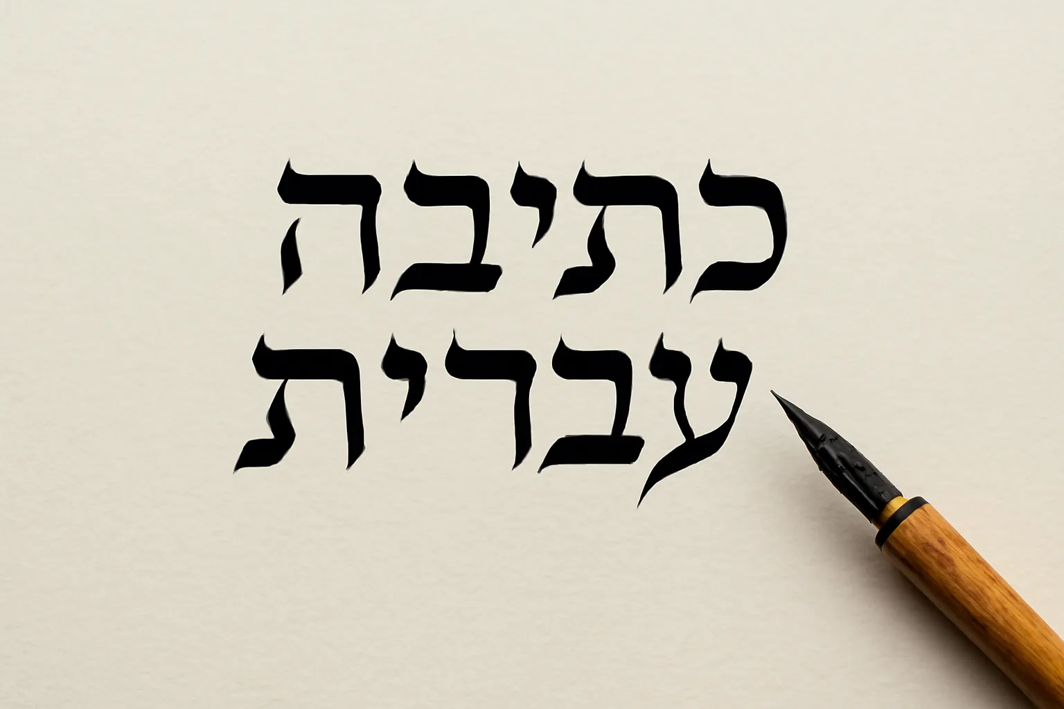
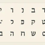
Hebrew calligraphy is a rich and evolving art form that blends precise pen craft with the expressive potential of a culture that values letters as both linguistic signs and visual symbols. From the sacred scrolls of the Torah to modern graphic design, Hebrew lettering carries history in its strokes while inviting contemporary creativity. This guide offers a comprehensive look at the traditions, techniques, and practical paths a student or enthusiast can follow to master Hebrew lettering, whether for liturgical manuscripts, personal meditation, or design projects.
Historical Foundations: From Ancient Letters to Modern Hands
The Hebrew alphabet has a long and layered history. What we now recognize as square Hebrew or Ktav Ashuri emerged as a standardized form in late antiquity and became the script most associated with Torah scrolls, ketubot, and printed Hebrew Bibles. This style is characterized by geometric, carefully balanced forms and a strong sense of vertical rhythm. In religious contexts, the scribal tradition emphasizes precise angles, proportional letter widths, and the avoidance of ambiguity—an aesthetic that supports the ideal of the text as a sacred object.
Alongside the fixed form of Ktav Ashuri, there developed a number of complementary scripts that broadened the cultural and literary reach of Hebrew writing. Rashi script, a semi-cursive style named after the medieval commentator Rashi, appears in many Jewish texts for commentaries and glosses. While not used for Torah scrolls, Rashi script has a distinctive texture and flow that readers recognize instantly. In manuscript culture, Sephardic and Ashkenazic handwriting traditions offered variations in the same family of letter shapes, reflecting regional aesthetics and scribal schools.
In addition to historical scripts, stam calligraphy refers to the practical scribal arts used to prepare tefillin, mezuzot, and Torah scrolls. Stam scripts emphasize a rigorous, rule-based approach to letterforms, with particular attention to the shapes of certain letters and the way they join (or avoid joining) in ink on parchment. This ritual vocabulary—kashrut, tagin (the little crowns on letters), and line-perfect baselines—remains a powerful touchstone for modern calligraphers who study traditional practice.
The 19th and 20th centuries saw a revival of interest in Hebrew typography and lettering, both in the context of national revival and in the broader world of design. Artists and typographers explored modern Hebrew calligraphy styles, brush lettering, and display scripts that could convey emotion, movement, and character beyond the strict requirements of sacred script. Today, a wide spectrum exists, from faithful reproductions of ancient forms to experimental, contemporary lettering that honors the alphabet while extending its expressive range.
Major Hebrew Calligraphy Styles and Variants
When studying Hebrew calligraphy, it helps to organize styles into family groups that share underlying mechanics, rather than viewing each variant as an isolated “font.” Below are several major families you will encounter, along with notes on typical uses and characteristic features.
Ktav Ashuri (Square Hebrew)
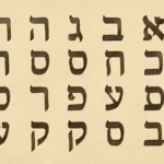
Ktav Ashuri is the canonical, block-like script used for Torah scrolls, prayer books, and most printed Hebrew texts. Its letters are highly geometric, with a clear emphasis on verticals and horizontals. In calligraphy practice, builders work on achieving a consistent stroke width, controlled angles, and balanced whitespace. Practice tasks often begin with single-letter exercises (aleph, bet, gimel, dalet) to cultivate rhythm and alignment before moving to word and line composition.
Rashi Script
Rashi script is a semi-cursive script that originated as a way to save parchment and speed up copying. It has a fluid, slightly condensed form compared with square script, with a middle ground between legibility and speed. Rashi script is frequently used for marginal notes, commentary, and certain educational editions of Hebrew texts. Calligraphers may study Rashi script to understand how letterforms can convey personality without sacrificing readability.
Stam Script and Practical Scribal Styles
Stam refers to the scribal tradition used for writing mezuzot, tefillin, and Torah scrolls. The stam approach emphasizes adherence to ritual and tradition, so the forms are precise but also expressive in their own way. Letters may have distinct shapes in delicately curved strokes along with deliberate spacing and line lengths. For many students, stam provides a bridge between ancient practice and modern design thinking: it teaches discipline, control, and reverence for the text as material.
Cursive and Hands‑on Modern Hebrew Lettering
Cursive Hebrew refers to the everyday handwriting forms that people learn in school. In calligraphy, cursive often becomes a style of its own—looser, more personal, and capable of rapid execution. Modern brush lettering in Hebrew expands this idea further, using brush pens, chisel markers, or traditional nibs to create expressive lines with variable thickness. This family includes both commercial display scripts and personal artistic scripts that you might see on posters, wedding invitations, or branding projects.
Brush lettering in Hebrew is a dynamic, often spontaneous practice that celebrates gesture, texture, and organic line variation. Brush artists may use wide brushes to create thick downstrokes and thin upstrokes, blending traditional letter shapes with contemporary form. In experimental work, designers push beyond conventional shapes—creating ligatures, decorative swashes, or modular compositions that still respect the legibility of Hebrew characters. This is where calligraphy intersects with graphic design and fine art.
Paleo-Hebrew and Thematic Variants
For artists who want to evoke antiquity or create a symbolic mood, Paleo-Hebrew motifs or revived letterforms offer a historical flavor. These variants are not standard in liturgical use, but they can provide texture and historical resonance in posters, book arts, and exhibitions. Incorporating paleo shapes requires careful study of historical inscriptions and a clear intention to evoke the past rather than to imitate it exactly.
Tools, Materials, and Workspace Setup
The practical side of Hebrew calligraphy begins with the right tools and a conducive workspace. The exact gear you choose depends on style, but the core categories are fairly universal: writing instruments, ink or pigment, surfaces, and layout aids.
Nibs and pens: traditional dip pens with flexible nibs, straight or oblique nibs for square script, or brush pens for brush lettering. The key is control over pressure to create the signature thick–thin contrast in Hebrew strokes.
Ink and pigments: sumi ink, walnut ink, or modern calligraphy inks work well. For parchment or vellum, ink compatibility and archival properties matter; you may choose iron gall alternatives for permanence or water-based inks for ease of cleanup.
Paper and surfaces: smooth bristle paper, parchment, vellum, or textured boards for display pieces. For Torah-scale work, parchment and quill-like tools are used, while posters and invitations tolerate smoother media.
Guides and rulers: light grids, baselines, and margin guides help maintain even line spacing and consistent letter height.
Markers and rulers for color and layout: you may use color pencils, gouache, or metallic inks for accents and initial sketches before final inking.
In practice, many calligraphers begin with pencil sketches on light graph paper, then transfer to ink after confirming letterforms, spacing, and alignment. For scriptural or ceremonial work, a period of tradition study—often with a teacher or mentor—helps ensure that your practical methods align with the historical expectations of the script you are emulating.
Techniques and Practice: Building Safe Habits
Mastery in Hebrew calligraphy comes from a blend of disciplined technique and patient practice. Below are core techniques you’ll encounter as you build your skill set.
Stroke order and direction: Hebrew letters grow from a set of directional strokes. Learning consistent entry points and the natural motion of each letter helps produce uniform shapes.
Pressure control: in pointed-nib or brush work, pressure creates the contrast between thick downstrokes and thin upstrokes. Practice even transitions to maintain legible letterforms.
Angle and slant: many Hebrew scripts rely on a subtle or pronounced slant to harmonize the line work across word columns. Practice with a guide line to maintain consistency.
Baseline and rhythm: spacing between letters and words should feel harmonious. A capable calligrapher treats each line as a rhythmical unit rather than a mere sequence of characters.
Letter construction: break letters into components (for example, the Hebrew aleph with its vertical stroke and internal counters) and practice recreating these features with precision.
Vowel marks (niqquim) and cantillation: in liturgical or educational contexts, vowels are optional in many texts but essential in others. Practice adding diacritics with care if your project calls for it.
A practical practice routine could look like this: begin with a 10–15 minute warm-up of basic strokes, then 20–30 minutes on a single letter, followed by 20 minutes of letter combinations to form simple words, and finally a 15–20 minute section on layout and composition. Over weeks, increase complexity by adding ligatures, ornamentation, or decorative elements like tagin in letters that invite them.
Composition, Layout, and Design Principles
Hebrew calligraphy is not only about faithful letter shapes; it also concerns how words live on a page or panel. A well-composed piece balances decorative energy with readability and purpose. Here are several design considerations that help you achieve refined work.
Orthography and legibility: for religious texts, legibility and accuracy take priority, and the layout often follows traditional patterns. In modern display work, you can experiment with spacing and line breaks to create visual emphasis while preserving readability.
Proportion and alignment: letter heights and baselines should be consistent. Human eyes perceive irregularities more readily than minor stylistic flourishes, so aim for a steady rhythm across lines.
Proportion of white space: margins, inter-line spacing, and letter spacing all contribute to the overall feel of a piece. A balanced use of white space often communicates calm authority or ceremonial gravitas.
Line breaks and word positioning: in artful Hebrew lettering, you may intentionally place line breaks to highlight a phrase, a blessing, or a symbol. The visual journey matters as much as the textual one.
Symbolic embellishments: flourish elements, ornamental crowns (tagin), and modest swashes can intensify the aesthetic; use them sparingly to avoid overpowering the lettering.
When working with traditional scripts for ceremonial use, you’ll encounter exacting conventions for how letters sit and relate to one another. In contrast, with modern Hebrew lettering, you might emphasize energy, movement, and contemporary aesthetics—still within the letterforms that the reader recognizes. The key is clarity first, then expression.
Practical Projects: From Practice to Publication
Whether your aim is a hand-lettered poster, an invitation, a personalized book plate, or a mock Torah page for a class project, practical projects help consolidate technique and taste. Here are some project ideas with suggested approaches.
Practice sheet series: create a set of sheets where you practice each letter form in Ktav Ashuri, then in Rashi script, and finally in a brush-letter style. Compare the forms side by side to notice how the same letter can take different identities.
Letter-word studies: take common Hebrew words (e.g., שלום, אהבה, שלום בית) and write them in two or three styles. Observe how spacing and alignment change the character of the word.
Decorative phrases: design a small poster or bookmark featuring a blessing or proverb. Start with pencil sketches, then ink, and finally add color accents or metallic ink to finish.
Religious texts practice: if you have access to a scriptorium or a legal framework for educational purposes, practice non-sacred sections that mimic standard formatting, while keeping within accepted rules of script usage for learning.
Modern display pieces: attempt a brush-lettering project for a family event or a local gallery. Use bold color, clean lines, and a legible arrangement to communicate mood and message clearly.
Regardless of the project type, build a consistent workflow: plan your layout, sketch lightly, test ink on scrap, and then execute. Record notes about letter shapes and spacing so you can replicate or revise in future work.
Diacritics, Pronunciation, and Meaning: A Short Lexicon
Hebrew lettering interacts with pronunciation and meaning in several nuanced ways. Here are brief definitions of terms you will encounter in study and practice.
Niqquim (vowel marks): optional in most traditional Jewish texts, but common in poetry, children’s books, and educational materials. When used, they guide pronunciation and melodic reading.
Tagin (crowns): little marks on certain letters (notably shin and dalet in ceremonial texts) that carry symbolic and aesthetic importance. They are a hallmark of traditional stam practice in Torah scrolls and related manuscripts.
Kashrut and adherence to traditional forms: for the sacred texts, the shapes and placement of letters must meet strict standards in many communities; understanding these expectations is essential if you are practicing in a religious context.
Hebrew ligatures: modern display work sometimes uses ligatures or connected forms to create a unified visual language, though this is less common in strict liturgical scripts.
Transliteration and transliteration aids: in some educational materials, you may find transliteration alongside Hebrew, which can influence how you choose to render space and emphasis in calligraphic work.
Applications: Where Hebrew Calligraphy Lives Today
Hebrew calligraphy is not a static tradition; it thrives in many modern contexts while preserving its ceremonial roots. Here are several notable applications and environments where calligraphy plays a crucial role.
Liturgy and ritual: careful calligraphy appears in printed prayer books, decorative Torah scroll replicas, and ceremonial manuscripts. While mass-produced texts rely on standard fonts, individual artisans may create illuminated or handwritten pieces for special occasions.
Education and pedagogy: teachers use calligraphy to teach reading, letter formation, and the connection between form and meaning. Posters, classroom charts, and student projects often feature Hebrew lettering in multiple script styles.
Art and graphic design: contemporary designers blend Hebrew lettering with photography, typography, and illustration to produce posters, album art, branding materials, and editorial graphics.
Personal and commemorative objects: custom invitations, wedding signage, and memorial pieces frequently use calligraphy to convey warmth, spirituality, or cultural identity.
Digital and printed fonts: while true calligraphy is hand-done, many designers translate the aesthetics into digital fonts or hybrid lettering that keeps the look and feel of traditional scripts while enabling scalable use.
Common Mistakes and How to Avoid Them
Beginners often stumble when translating theory into practice. Here are frequent missteps and practical tips to avoid them.
Overemphasizing ornamentation at the expense of legibility: extra swashes and tagin can overwhelm the letterforms if not restrained. Tip: practice disciplined baseline alignment first, then add subtle embellishments.
Inconsistent line weight: inconsistent pressure or nib wear leads to a choppy appearance. Tip: practice uniform pressure and keep your nib clean; begin with light strokes and gradually increase pressure as needed.
Inaccurate letter proportions: letters can drift in width or height across a line. Tip: shoot for a fixed cap height and baseline; use guides until you can maintain consistency without them.
Ribboning too quickly on longer lines: rushing lines compromises cadence and spacing. Tip: slow down, maintain breath-like rhythm, and treat each word as a single unit in composition.
Ignoring cultural context: in ceremonial contexts, it is respectful to learn about the tradition behind the script. Tip: study the conventions of stam practice if you intend to work with liturgical materials.
If you are new to Hebrew calligraphy, a practical, phased approach helps you progress steadily while building confidence. Here is a suggested roadmap that balances study, practice, and creative exploration.
Foundations: study the Hebrew alphabet in multiple scripts (Ktav Ashuri, Rashi, and a basic cursive). Learn letter names, basic stroke order, and how to form consistent shapes.
Tools and baseline setup: choose your primary tool (nib, brush, or marker) and establish a comfortable height, angle, and grip. Create a clean workbench with guides and light pencil lines for alignment.
Structured practice: dedicate time to single-letter drills, then short word blocks, and finally simple phrases. Focus on vertical rhythm and spacing before introducing ornaments.
Identity through style: after achieving consistency, experiment with 2–3 style variations. Compare the feeling of each style and determine which best fits your project goals.
Portfolio and critique: assemble a small portfolio of practice sheets, then seek feedback from mentors or peers. Use critique to refine letter forms, spacing, and composition.
Applied projects: move to decorative pieces, invitations, posters, or a ceremonial text project if you have access to a suitable setting or audience.
The journey is iterative. Each project offers lessons about control, pace, and expression. The more you practice, the more you’ll sense where to sustain traditional fidelity and where to bring in your own voice.
Library of Resources: Books, Courses, and Communities
A robust learning path often involves a blend of self-guided study, live instruction, and community feedback. Here are categories of resources you may find helpful.
Books and manuscripts: look for titles on Hebrew scribal practice, introductions to Ktav Ashuri, and visual catalogs of letterforms and ornamentation. Book references often include historical examples that illuminate how letters behave in different contexts.
Workshops and classes: local art centers, religious study houses, and design schools sometimes offer Hebrew calligraphy workshops, ranging from beginner to advanced levels. Hands-on feedback accelerates skill development.
Online tutorials and video demonstrations: step-by-step demonstrations cover stroke dynamics, nib maintenance, and layout planning. A growing number of artists share process videos detailing their approach to both traditional and contemporary Hebrew lettering.
Community and critique groups: joining a local calligraphy club or online forum provides a space to exchange critiques, swap practice sheets, and discuss stylistic choices in a respectful, constructive environment.
As you explore resources, consider distinguishing between those that emphasize ritual fidelity and those that celebrate graphic expression. Both strands are valuable, and many practitioners blend them in respectful, meaningful ways.
Ethical and Cultural Considerations
Hebrew calligraphy sits at the intersection of language, tradition, and identity. When you study or create work that references sacred texts or communal symbols, approach with reverence and intellectual honesty. If you work within a religious community, follow the standards of the tradition and seek guidance as needed. When making decorative or educational pieces, be mindful of the cultural significance of the letters and the contexts in which they appear.
Frequently Used Terms in Hebrew Calligraphy
This short glossary can be a helpful reference as you begin practicing or comparing different scripts.
Ktav Ashuri — Square Hebrew script used for canonical religious texts.
Rashi script — Semi-cursive script used in commentaries and some educational materials.
Stam — Scribal tradition for mezuzot, tefillin, and Torah scrolls.
Tagin — The crowns on certain letters, a feature of traditional scribal practice.
Niqquim — Vowel points used in some texts and instructional materials.
Paleo-Hebrew — An ancient variant used for decorative or historical references.
Brush lettering — A modern, dynamic approach using brush pens or brushes to create expressive lines.
Ligatures — Connections between letters that can unify multiple characters in a decorative layout.
Closing Thoughts: The Living Eye of Hebrew Lettering
Hebrew calligraphy is not a fixed museum artifact; it is a living practice that travels between sacred texts, classrooms, studios, libraries, and digital screens. The alphabet is a roster of shapes that invite the eye to move, the hand to respond, and the mind to engage with meaning and mood. Whether you are drawn to the spiritual discipline of Ktav Ashuri, the historical texture of Rashi script, the ritual discipline of Stam, or the liberating energy of modern brush lettering, you enter a field with a long memory and a wide horizon.
If you are starting today, remember that progress in Hebrew calligraphy happens in small, patient steps: perfect one letter form, master a short word, learn to lay out a single line with rhythm, and gradually escalate to longer compositions. Let your practice be as steady as a line that grows from baseline to cap height, and let your curiosity guide you toward styles that resonate with your goals. With time, you will find your own voice within the traditions—one that respects the past while inviting others to read the present through the beauty of Hebrew letters.